OPEX.AI
A workflow automation platform that uses AI to improve operational efficiency for teams.
opex.ai

problem
Teams rely on complex workflows and tools that are often fragmented, manual, and hard to manage. As processes grow, it becomes difficult to track work, reduce inefficiencies, and keep systems aligned, which slows teams down and creates unnecessary overhead.
solution
Opex AI streamlines internal workflows by using AI to organize, automate, and surface the most important work in one place. The platform helps teams move faster by reducing manual effort, improving visibility across processes, and making complex operations easier to manage.
Key Contributions
Opex AI was an early-stage product with no existing structure, so much of the work started from rough ideas and had to be shaped into clear, usable experiences. My focus was on turning complex workflows into interfaces that felt understandable, trustworthy, and practical for real teams to use.
• Designed core product processes including onboarding, dashboards, workflows, permissions, and the AI chatbot.
• Defined how users navigate through the product and complete key tasks.
• Established the product’s design foundations, including layouts, interactions, and core UI patterns.
• Designed complex features like version control, approvals, and role-based permissions in a way that stayed understandable for non-technical users.

Process
This project required constant iteration. Because the product was early-stage and evolving, the process wasn’t linear. Priorities shifted, scope changed, and the user flow was refined repeatedly as we balanced user needs with technical and time constraints.
Research & Planning
Reviewed early product ideas, competitive tools, and internal goals to understand what was feasible and valuable.
Mapped user flows early to clarify what the product actually needed to support.
Design & Prototyping
Moved quickly between low-fi flows, mid-fi wireframes, and high-fi UI to explore direction.
Iterated heavily on core experiences like the chatbot layout, permissions, approvals, and versioning as requirements became clearer.
Development & Implementation
Worked closely with engineers to keep designs realistic and buildable.
Adjusted designs based on technical constraints and regularly aligned with PM to refine scope and priorities.
Testing & Optimization
Reviewed designs continuously with stakeholders and refined based on feedback.
Simplified or cut features that were too complex for the timeline while preserving core functionality and usability.
Onboarding
Why it is important
The first interaction with the product sets the tone. If sign-up feels confusing or cluttered, users lose trust before they even reach the core experience.
What I designed
Approach → Since this was a brand-new product with no existing visual reference, I focused on making the flow feel familiar and intuitive so users wouldn’t have to “learn” the interface before they could start using the product.
Reasoning → I used common patterns (simple email/password, Google login, straightforward reset flow) because onboarding isn’t where users should spend cognitive effort.
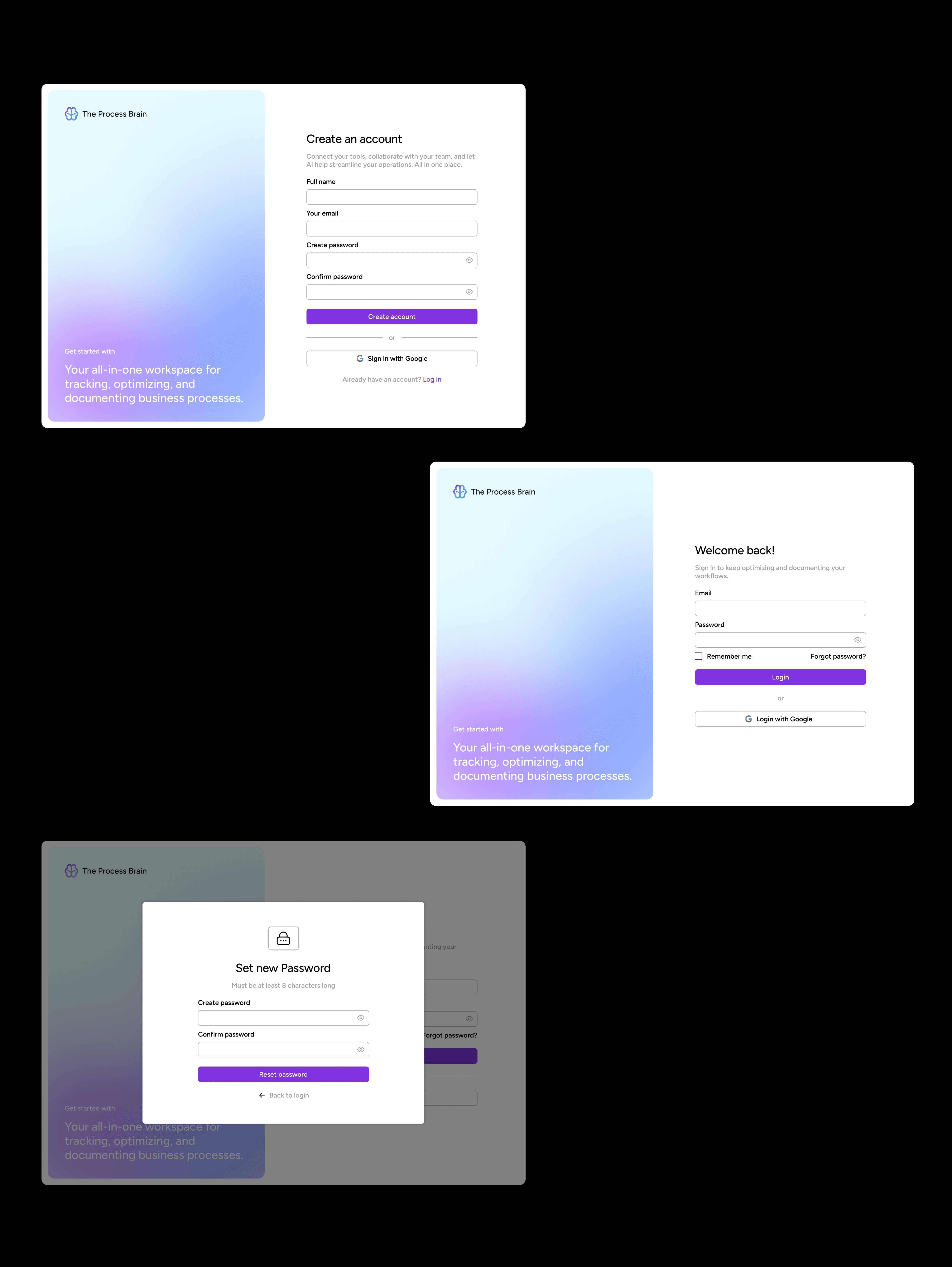
Key features
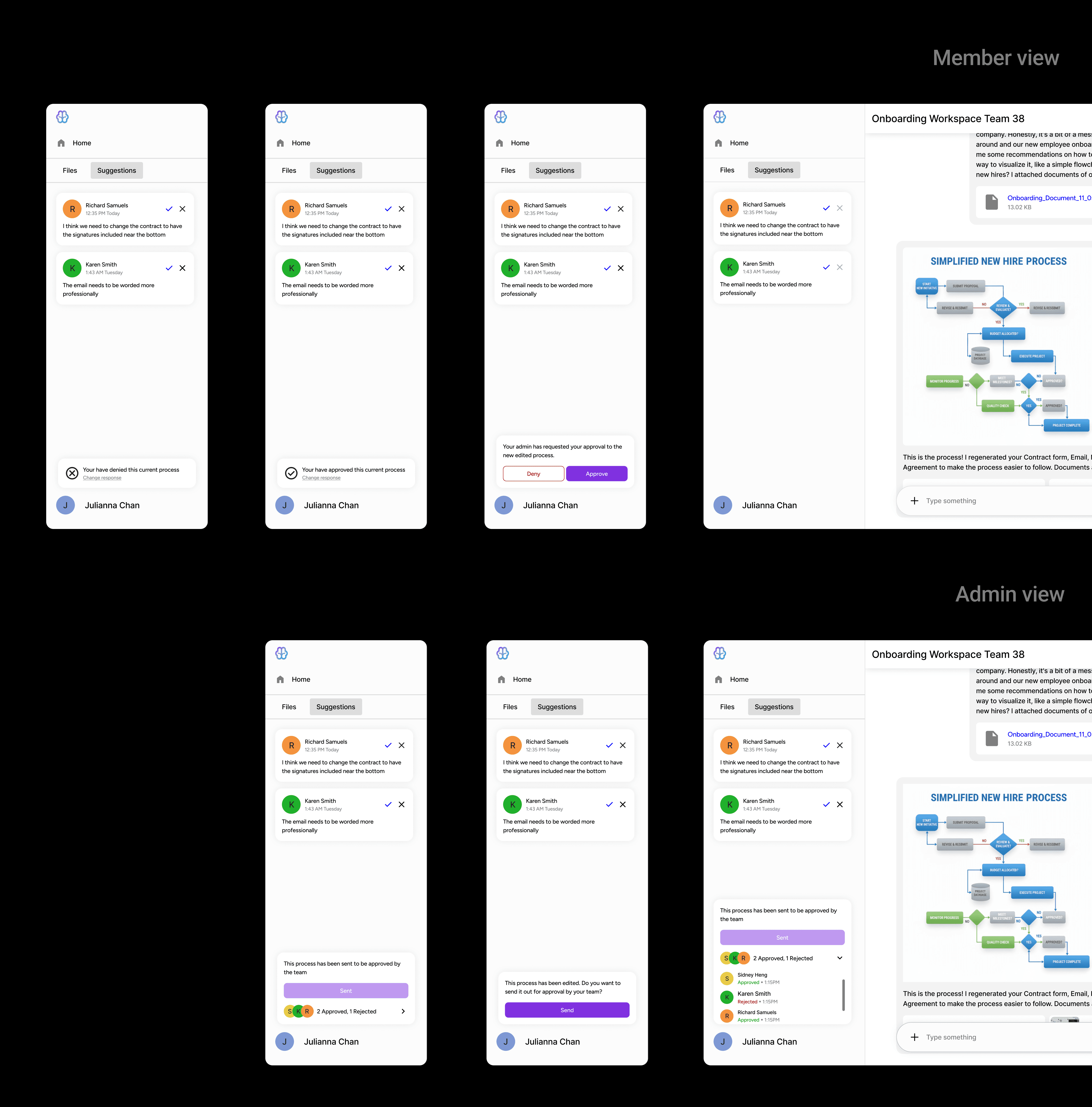
Inline comments on generated work
Keeps feedback anchored to the actual content instead of floating elsewhere.
Send for approval + approve/deny actions
Makes decisions explicit instead of relying on informal messages.
Approval states (pending, approved, rejected)
Helps everyone quickly understand whether something is finalized.
Member list inside the workspace
Makes it clear who is involved and who is responsible.
Role-based controls
Ensures sensitive actions are protected while still supporting collaboration.
Version History & Generative Document Control
Why it is important
Early on, we realized people didn’t trust AI tools that felt like they were “doing things behind the scenes.”
Users needed a safe way to explore AI-generated outputs without losing trust or accidentally breaking important workflows.
What I designed
A generative workspace where users can easily review, compare, and control AI outputs.
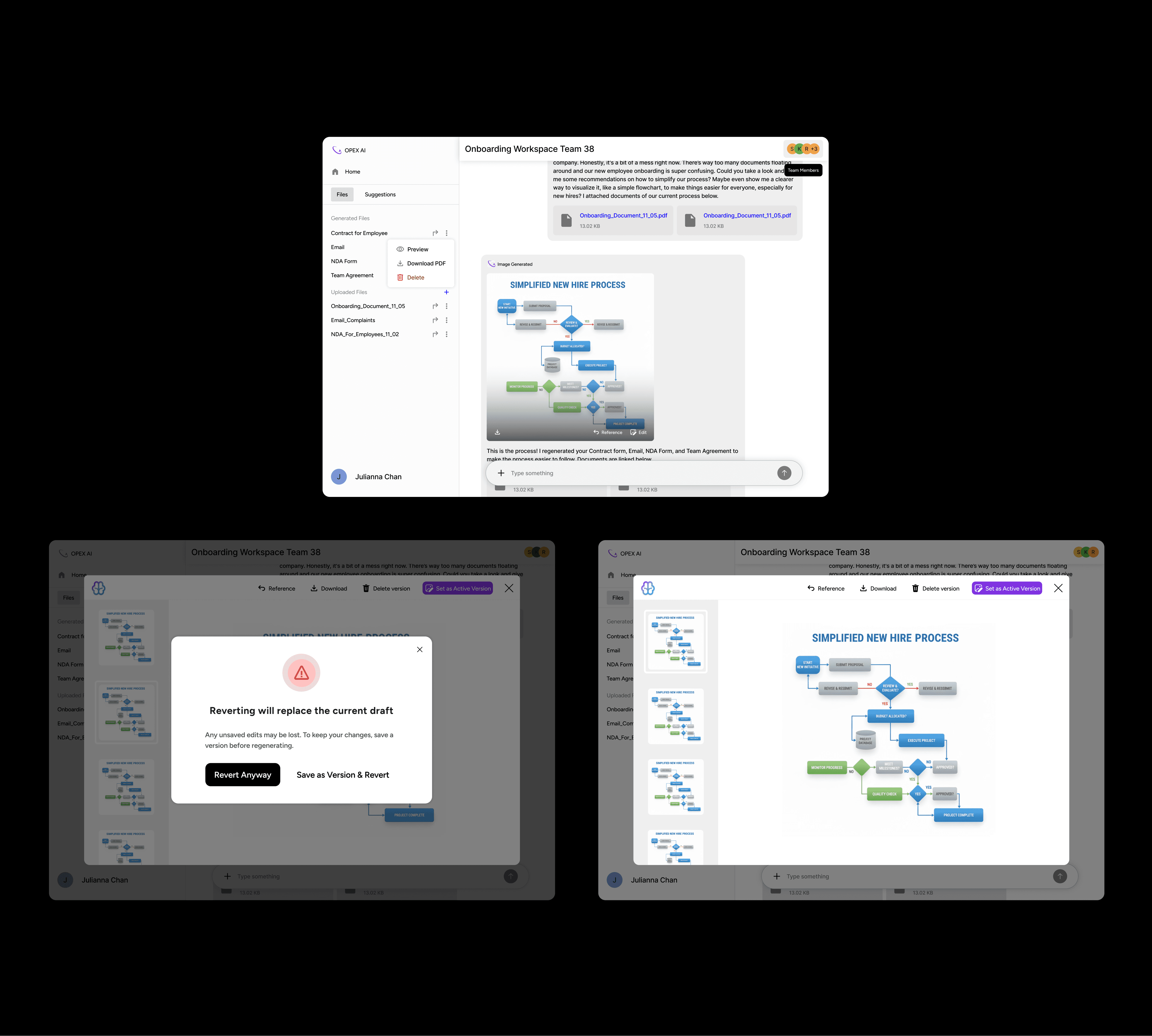
Key features:
View generation history with scrollable previews of past versions
Allows users to compare versions without losing their place.
Open previous versions directly inside chat
Keeps review in context instead of forcing users to switch views.
Download, reference, or delete individual versions
Gives users control over how they manage and reuse outputs.
Clear “Set as Active” confirmation warning when switching versions so users understand downstream impact
Prevents accidental overwrites and clarifies when changes will affect other documents.
Visual hierarchy that separates AI output vs user decisions, reinforcing transparency
Makes it obvious what the system generated versus what the user approved.
Collaboration & Approvals
Why it is important
Without a built-in review system, teams had no clear way to finalize AI-generated work. Feedback was scattered across external tools like Slack and email, making it difficult to track decisions or understand why changes were made. Ownership was also unclear, leaving teams unsure who was responsible for approvals or whether a process was actually ready to use.
What I designed
Approach → Since this was a brand-new product with no existing visual reference, I focused on making the flow feel familiar and intuitive.
Reasoning → I integrated approvals directly into the workspace so that "doing the work" and "reviewing the work" happen in one place. This reduces the effort needed for "human-in-the-loop" oversight, which was a core project goal.
Key features
Email signup + Google SSO
Simple login flow
Clear password reset
Team Permissions & Role-Based Access
Why it is important
Without clear permissions, collaboration tools quickly become risky. Anyone can accidentally edit or override critical work, ownership becomes unclear, and teams lose trust in the system. We needed a way to support collaboration while still protecting important actions.
What I designed
Approach → I designed a simple role-based permissions system (Owner, Admin, Member) that worked consistently across both the dashboard and the chatbot.
Reasoning → Teams needed structure without complexity. Making roles visible and consistent helps prevent accidental changes, clarifies ownership, and builds trust in collaboration.
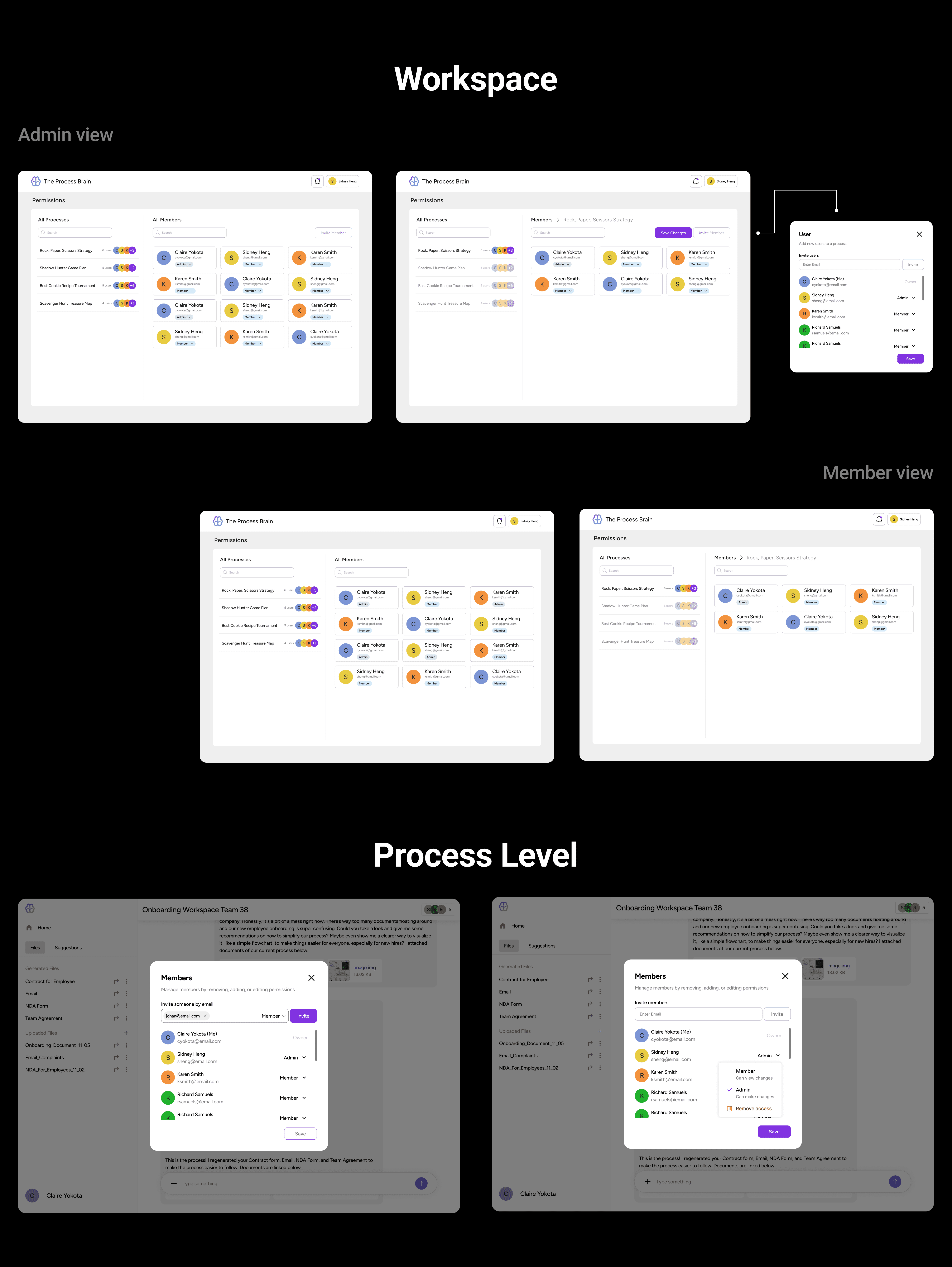
Key features
Clear roles (Owner, Admin, Member)
Makes responsibility and authority visible instead of implied.
Separate admin vs member experiences
Prevents sensitive actions from being exposed to the wrong users.
Invite flow with role assignment upfront
Encourages intentional access control instead of fixing permissions later.
Permissions visible at both workspace and process level
Helps users understand who has access to what at a glance.
Consistent behavior across dashboard and chatbot
Reduces confusion by keeping permission logic predictable across contexts.
Conflict & Resolution
Because this was an early-stage product, a lot of things were unclear while we were designing. Scope shifted, priorities changed, and we were often figuring out the product direction in real time.
1. Shifting direction
The user flow changed multiple times as we learned what actually mattered and what was feasible
I updated designs quickly while keeping the overall experience consistent, so the product didn’t start to feel fragmented
2. Balancing ideas with reality
Some features sounded good in theory but were too complex to build in the timeline
I worked closely with PM and engineers to simplify flows and redesign interactions without losing user clarity or control
3. Creating alignment when it was missing
When communication gaps slowed progress, I initiated more frequent syncs to unblock decisions
This helped the team move faster and reduced confusion around priorities and expectations
Outcome:
Despite ambiguity, we delivered a cohesive product. The project strengthened my ability to design under uncertainty, communicate clearly, and make practical decisions without sacrificing quality.
Wrap-Up
Biggest Challenge
We were designing without clear product references or strong client direction, which meant constant ambiguity.
I handled this by staying in close communication with the team, doing competitive research, and iterating until the flows and visuals felt grounded and usable.
Key Takeaways
This project reinforced how important clear user flows are. We continued to catch gaps even late in the process, and it reminded me that familiar patterns like chat interfaces still need to be thoughtfully adapted to each product’s context.
see also