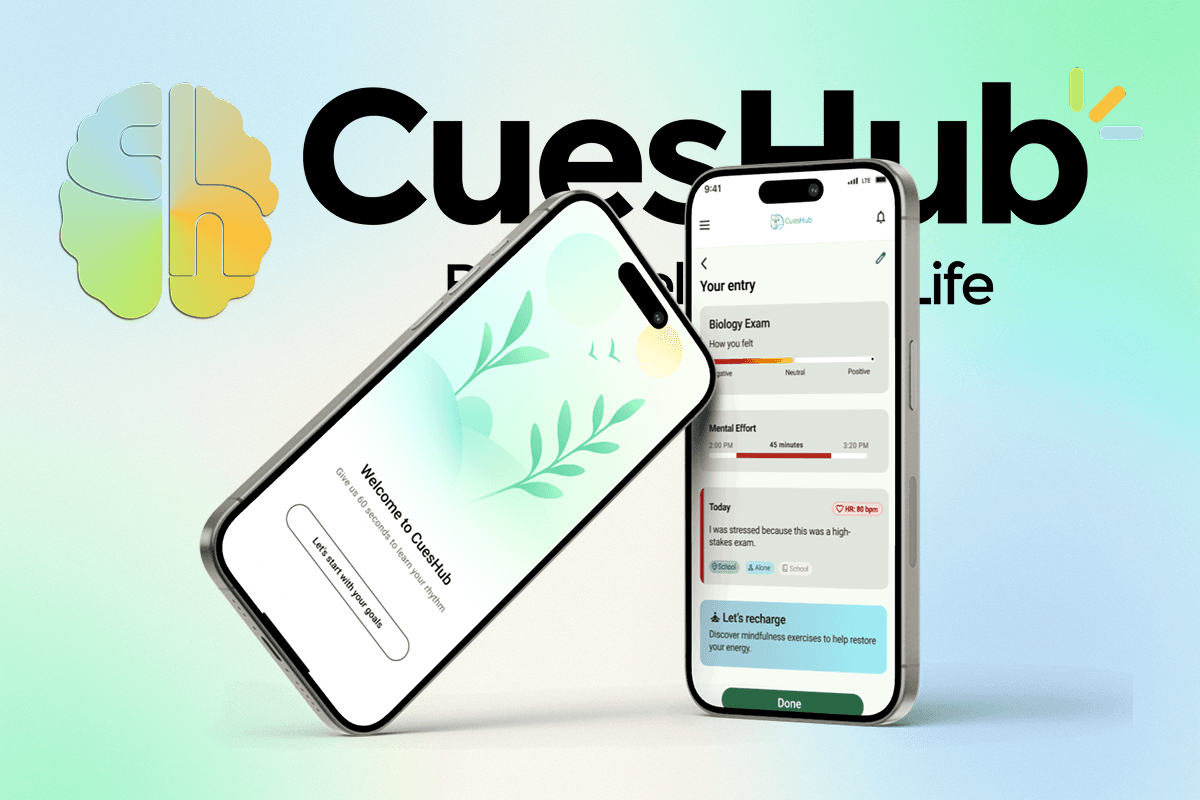
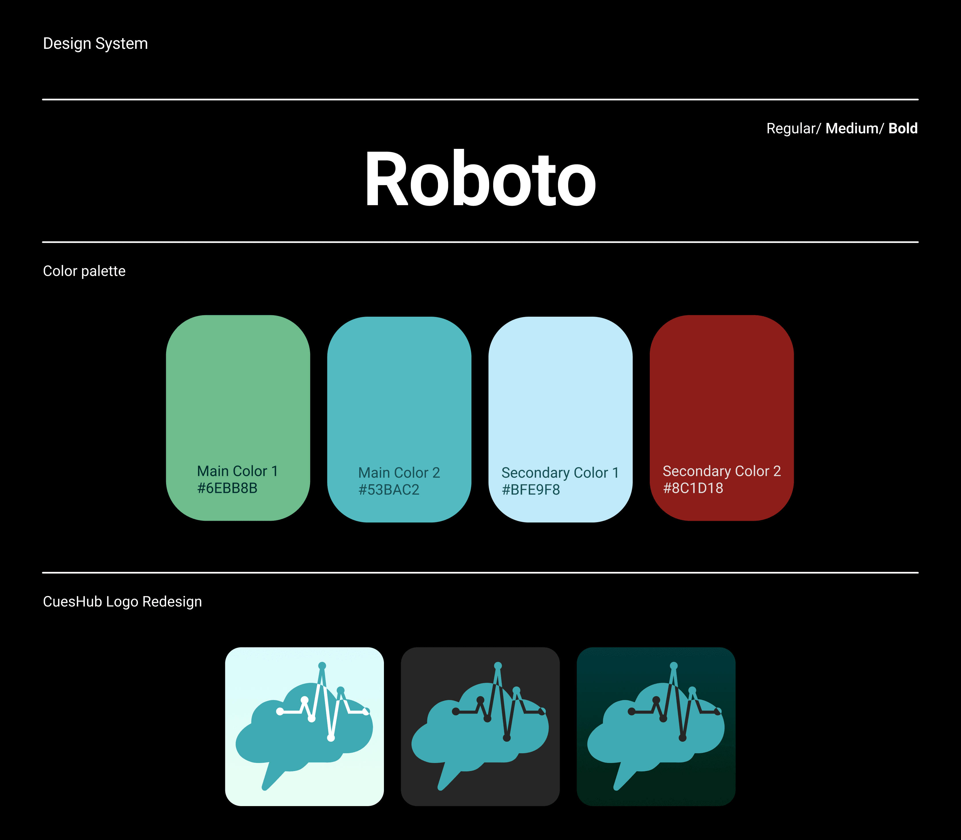
CuesHub
An AI-powered wellness app that helps people understand their mental workload and build healthier habits around stress and recovery.
cueshub
problem
Mental strain is invisible and easy to ignore until it leads to burnout. People in high-intensity roles often push through exhaustion without realizing the toll it takes on their body. Even when data exists, it’s usually hard to understand or act on.
solution
CuesHub turns complex biosignal data into clear, everyday insights. The app helps users see how much mental capacity they’ve used, understand when to rest, and make healthier choices.
year
2025
timeframe
3 Months
tools
Figma, Jira, Github, Reddit
team
5 Designers, 8 Developers, 4 Marketers, 2 CEOs
category
AI-Powered Wellness Platform + Product Design + UX Research
Key Contributions
I worked on core product surfaces while also supporting the design process behind the scenes, making sure ideas translated into clean, buildable work. Much of my time went into producing production-ready designs that engineers could implement directly, refining flows through feedback, and keeping patterns consistent so the product felt cohesive instead of stitched together.
• Designed the onboarding flow that introduced users to mental stamina and biometric insights.
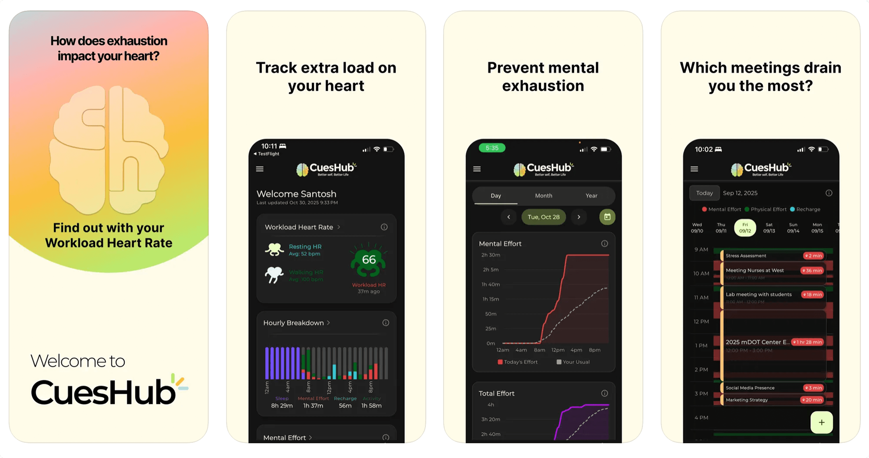
• Designed key app screens for tracking daily mental capacity and workload.
• Created smartwatch UI concepts for live mental stamina feedback.
• Designed notification flows that helped users act on their data throughout the day.
• Shaped how users interpret and trust their metrics through visual hierarchy and UX decisions.
Research & Key Findings
I ran a focused 3-week research sprint before jumping into UI.
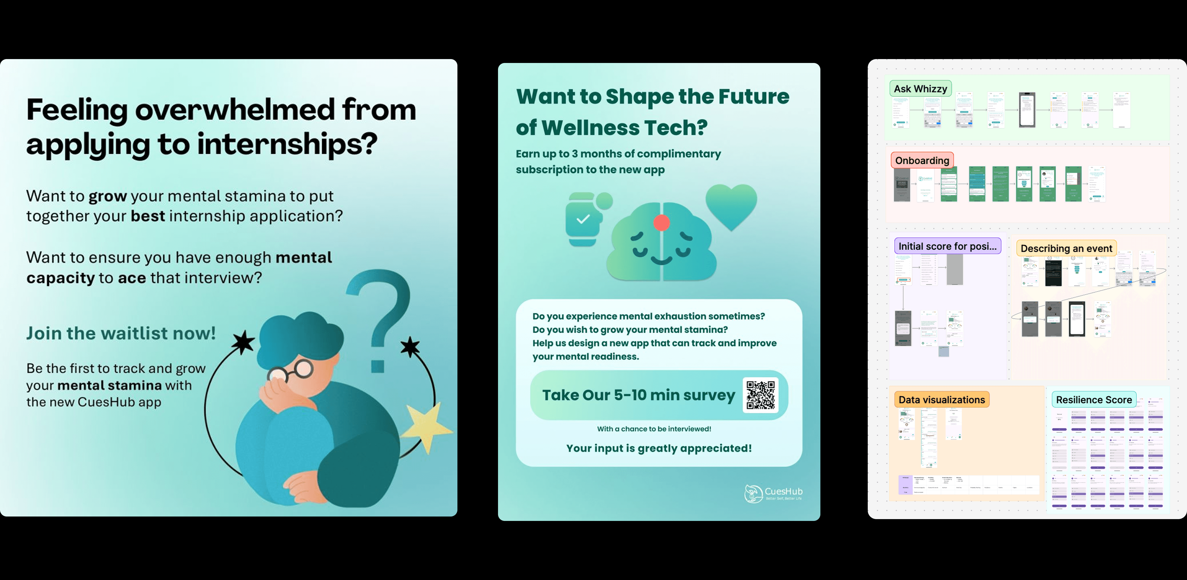
What I did
Conducted targeted user interviews to understand emotional triggers, burnout patterns, and barriers to consistency
Designed and distributed surveys across Reddit, Threads, LinkedIn, and wellness communities, collecting 100+ responses
Ran competitive research on apps like Calm, Apple Health, and Garmin to identify gaps in trust, motivation, and emotional tone
Audited the existing product to find friction points in onboarding, engagement, and trust
Created research-driven visual assets (flyers + posts) to increase participation and reach
What I learned
These insights directly shaped the product direction:
Users hesitate to share health data if they don’t understand how it’s used → transparency builds trust
People prefer reflection and meaning over raw metrics → tone matters as much as data
70% wanted only 1–3 notifications per day → less noise, more intentional prompts
Users trusted watch data more than manual logging → passive tracking is key to consistency
Trust and clarity consistently came up as top drivers of engagement
Why this mattered for the product
These findings directly influenced:
A calmer, more empathetic onboarding flow
Softer visual language instead of clinical dashboards
Fewer, higher-quality nudges
Watch-first interactions instead of manual-heavy flows
A stronger focus on trust, transparency, and emotional safety
Onboarding

I designed the entire onboarding experience, including the illustrations, to feel calm, personalized, and human-centered.
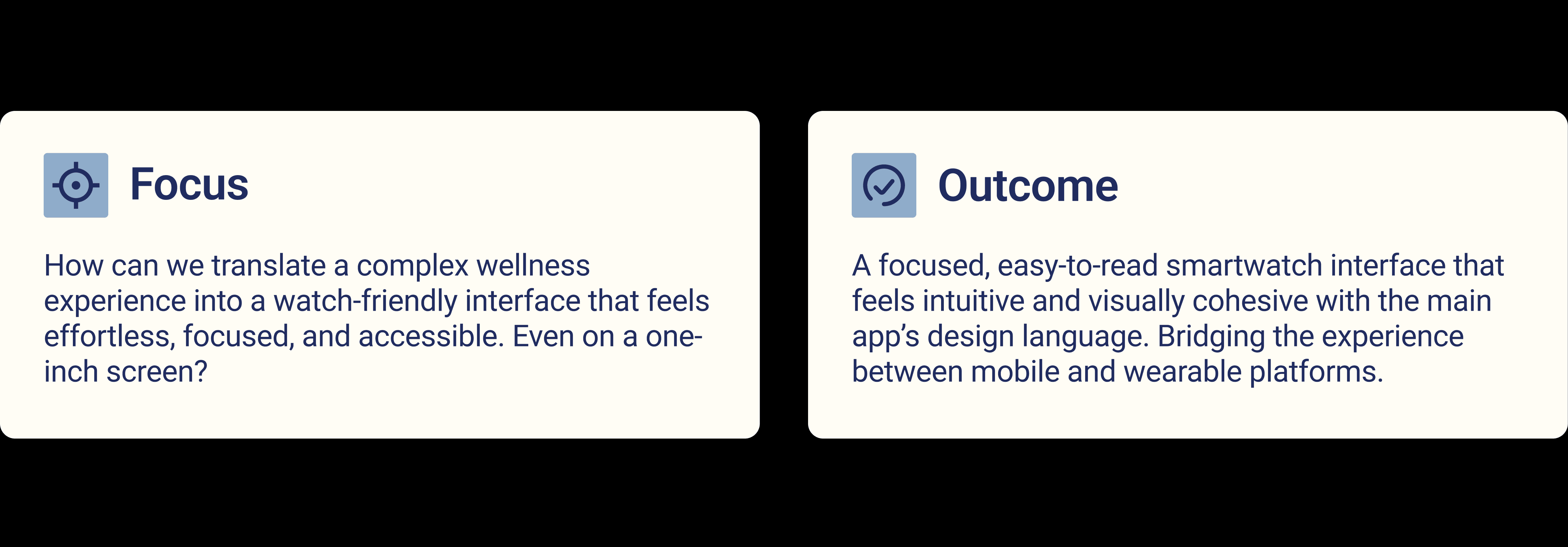
Smart Watch
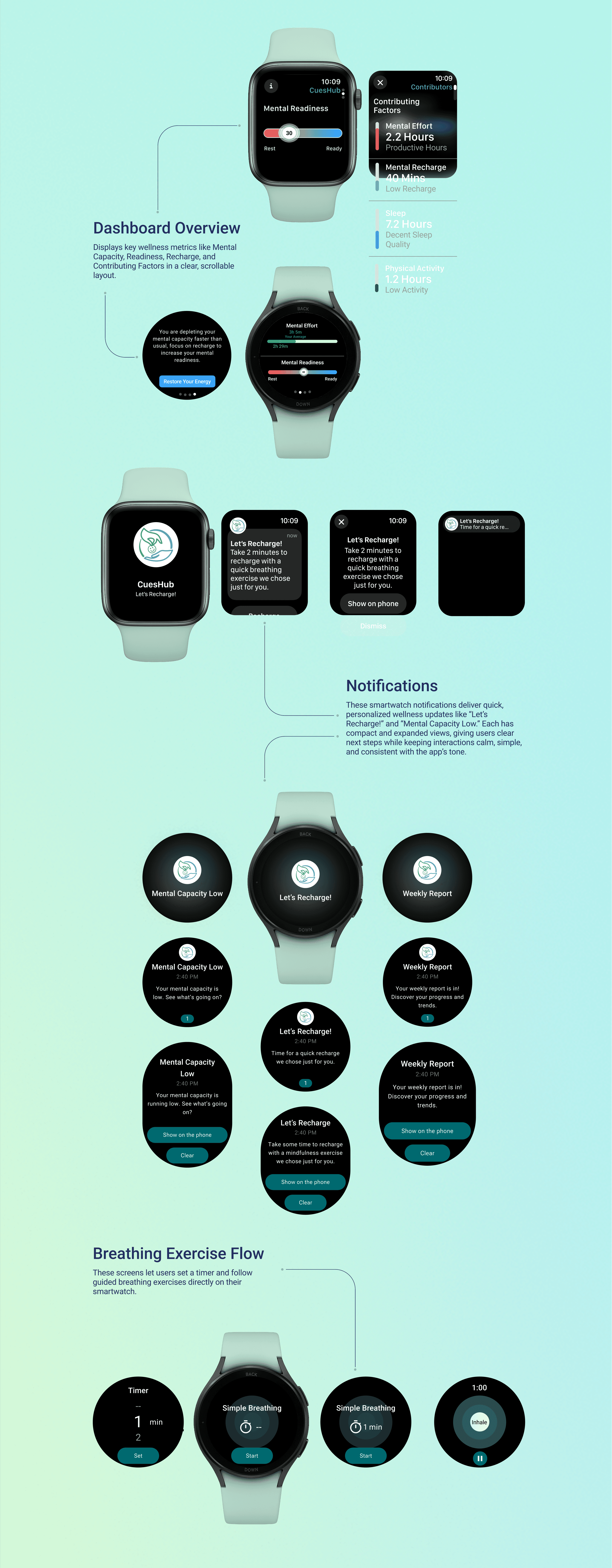
I researched Apple and Galaxy Watch design standards and created simple, glanceable interfaces that highlights key health metrics while staying calm, intuitive, and brand-consistent.
Conflict and resolution

The product needed to feel calm, credible, and easy to use even though the underlying science is complex.
My design approach focused on three things:
1. Make invisible data feel human
I designed screens that translate abstract metrics into understandable language, visuals, and emotional cues so users could actually interpret their state instead of feeling confused or overwhelmed.
2. Design for real-life behavior
Flows were structured around when users are most tired, busy, or distracted. Onboarding, notifications, and smartwatch interactions were designed to fit naturally into daily routines rather than demand attention.
3. Ship designs engineers could build
Much of my time went into producing production-ready designs that engineers could implement directly. That meant tight component systems, realistic states, edge cases, and layouts that scaled across devices.

Strategy
Onboarding
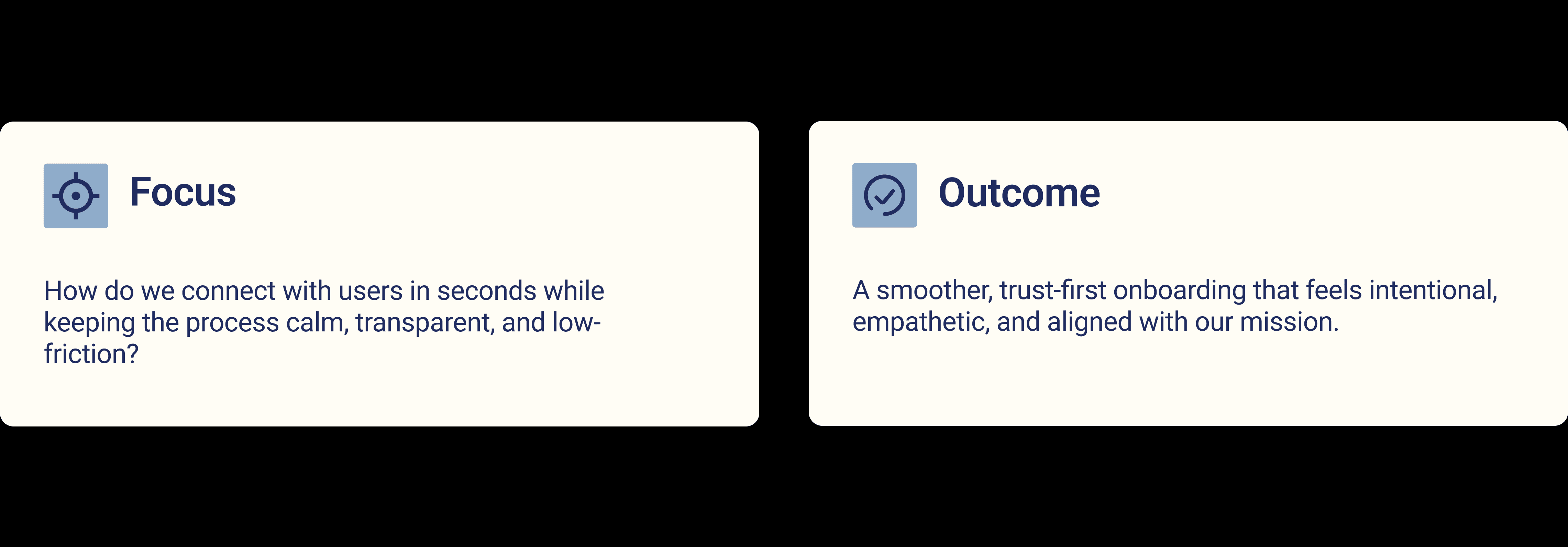
Goal
Build an onboarding experience that earns trust within seconds and keeps users engaged beyond day one.
Process
I explored different ways to help users feel guided instead of overwhelmed. From chatbot-style onboarding and story-based flows to more data-driven ideas that tie into mental wellness. Each concept focused on setting the right tone and clearly communicating what CuesHub stands for.
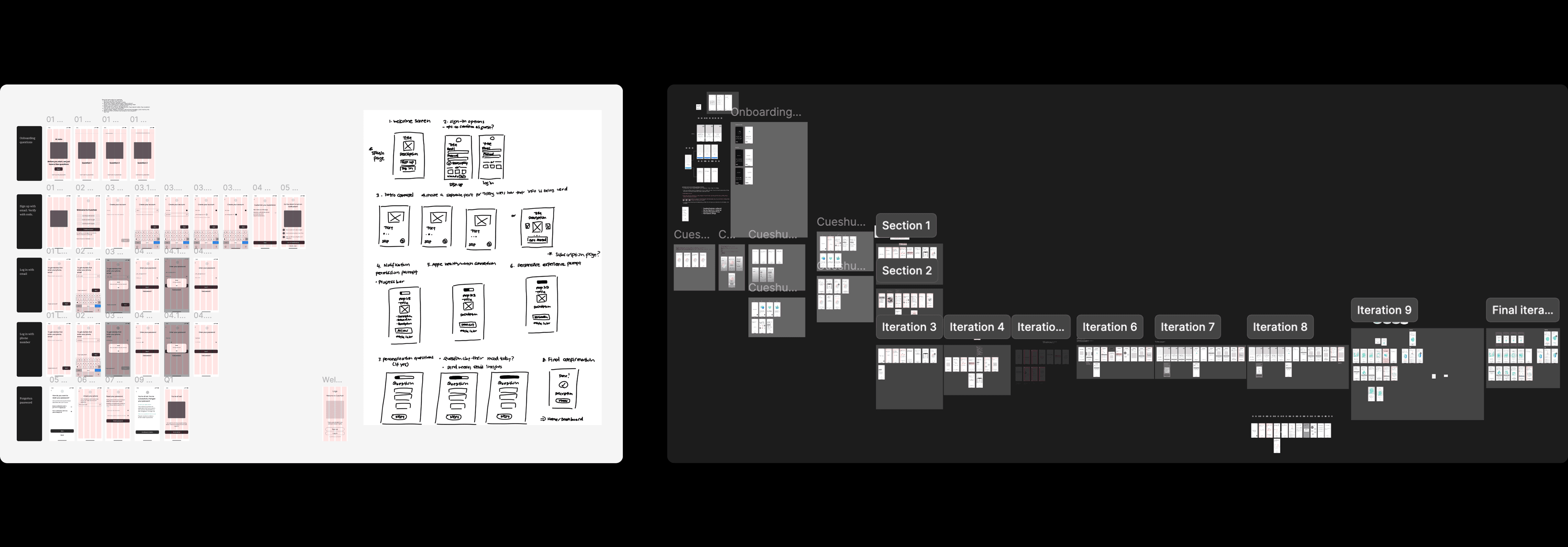
Iteration Journey
Went through 10+ rounds of feedback and over 100 frames of design updates
Worked closely with the CEOs, developers, and designers to make sure the flow was both friendly and realistic to build
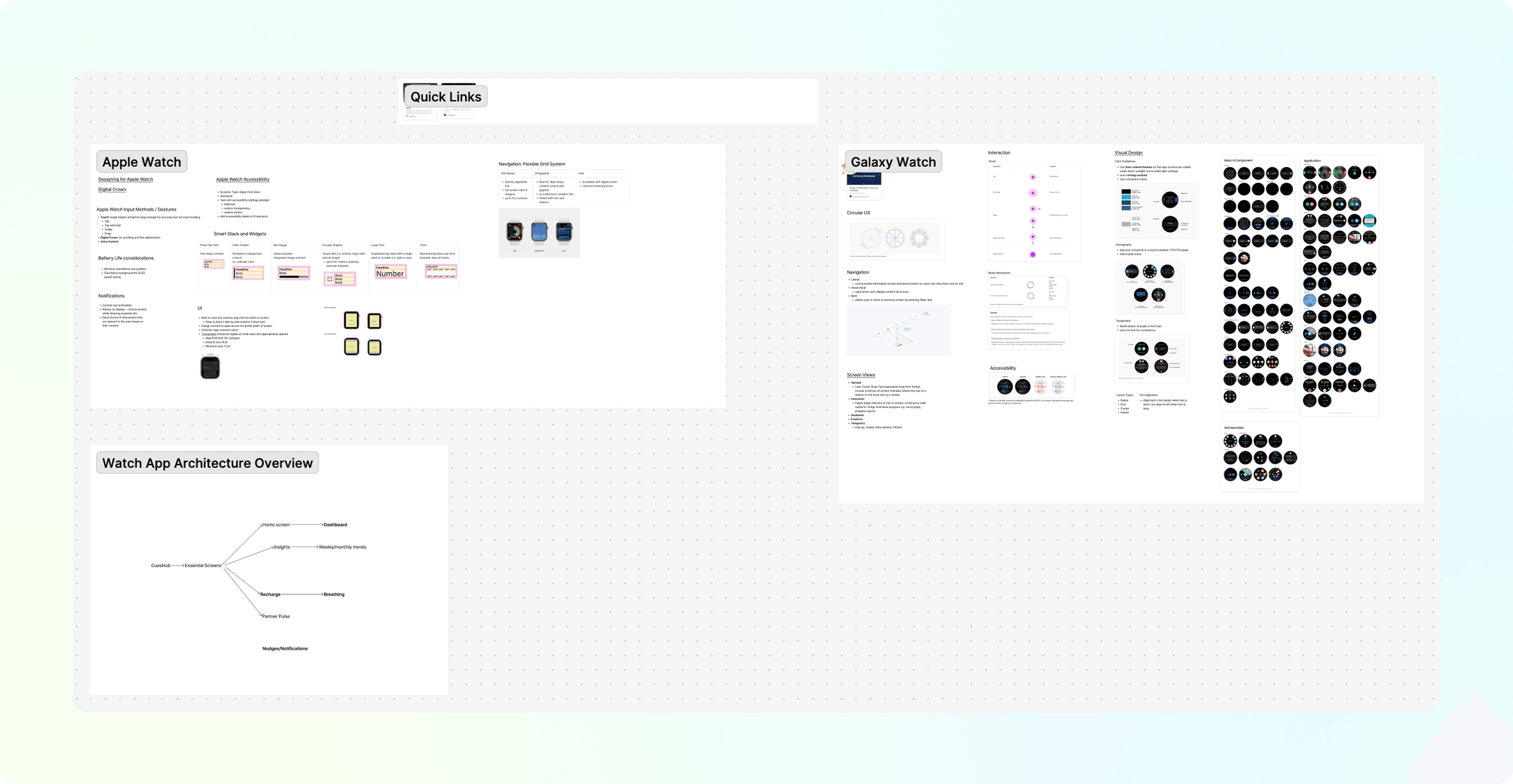
Smart Watch
This was my first time designing for a smartwatch, so I had to start from the ground up. I researched Apple Watch interface patterns, accessibility standards, and motion guidelines to understand how to simplify information for such a small screen.
Iteration Journey
Conducted extensive research on UI constraints, screen dimensions, and input methods (tap, swipe, scroll)
Studied existing health and fitness apps to see how they balanced clarity and minimalism
Iterated on multiple layout versions to test readability, spacing, and color accessibility
Created a clean, glanceable interface that prioritizes essential metrics and reduces cognitive load
The Results
562 bpm reduction in Workload Heart Rate
Reported by the CEO as the app’s measured impact across users in the first 3 months.Altmetric score: 469
Research connected to the product’s domain achieved high visibility and engagement.Covered by 46 news outlets
Demonstrates strong public and media interest in the space CuesHub is building in.
More importantly, it was meaningful to see the work had a positive impact on people’s lives.
Future Plans + Where Cueshub is Right Now
My Takeaways
Working at a startup pushed me to wear many hats. From designing logos and promotional materials to shaping key UX/UI flows for major product pages.
It challenged me to balance creativity with clarity, communicate effectively across a large team, and stay adaptable through fast-paced iteration.
Next Steps
I’d love to explore building a more conversational, mascot-driven experience next.
I’m excited to continue refining my visual and interaction design skills while exploring how personality and emotion can make digital experiences feel more human.
Follow-Up: Where is CuesHub now?
CuesHub is now live on the App Store, turning our summer prototypes into a product helping people manage mental exhaustion through Workload Heart Rate (WHR).
It’s already making an impact in hospitals, clinics, and universities. Motivating real lifestyle changes. Seeing our designs come to life and support users’ well-being has been incredibly rewarding.


