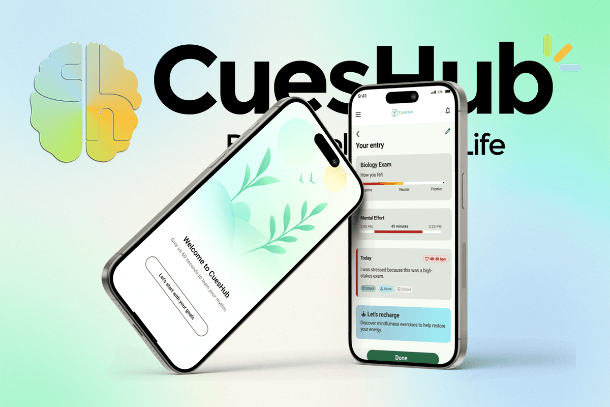
BN.CO
A data-driven platform that helps companies optimize ad spend across channels
bn.co

problem
BN’s ad optimization tool originally lived inside a long, dense spreadsheet filled with endless rows of numbers. It was difficult to scan, hard to interpret, and easy to misread. Even experienced team members struggled to use it confidently, which made the tool feel more like a barrier than a support.
solution
We redesigned the experience into a structured web product that translated complex data into clear, visual screens. The focus was on helping users quickly understand performance and confidently take action.
Key Contributions
Designed the full onboarding experience, shaping how users first understand and move through the product
Simplified complex concepts into clear, step-by-step flows
Designed production-ready screens used by engineers for implementation
Contributed to overall product structure to improve clarity and usability

Strategy
We started by making sense of what already existed and narrowing in on what the client needed. A lot of early work focused on clarifying goals, aligning on priorities, and understanding how people were currently using the product.
Conducted
internal interviewswith marketing and engineering teams to understand workflows and expectationsRan a
competitive analysisof similar enterprise dashboards to identify useful patterns and gapsAudited the
existing BN interfaceto surface issues around clarity, consistency, and accessibility
This foundation shaped how we approached onboarding, layout decisions, and overall structure of the product.
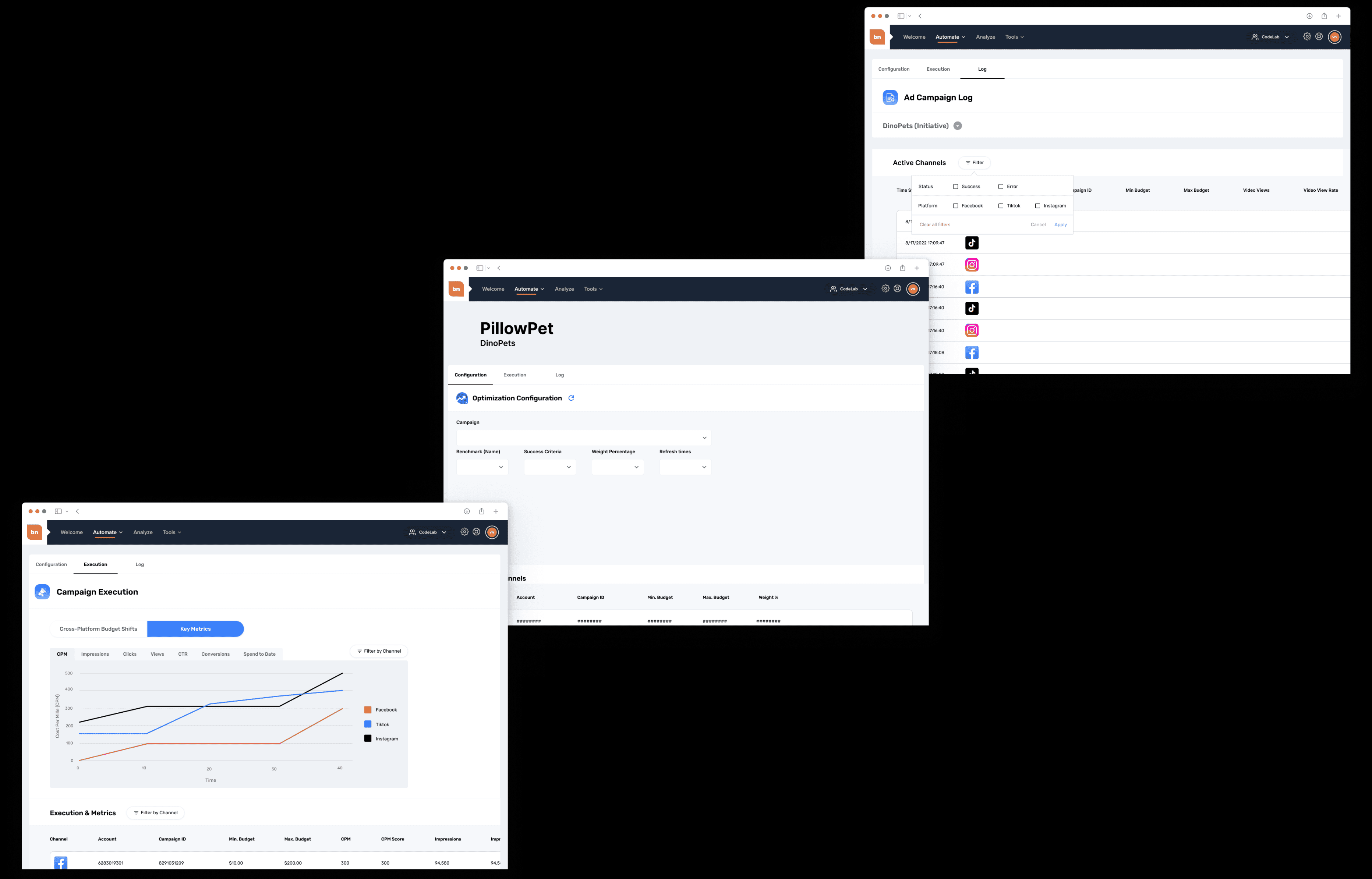
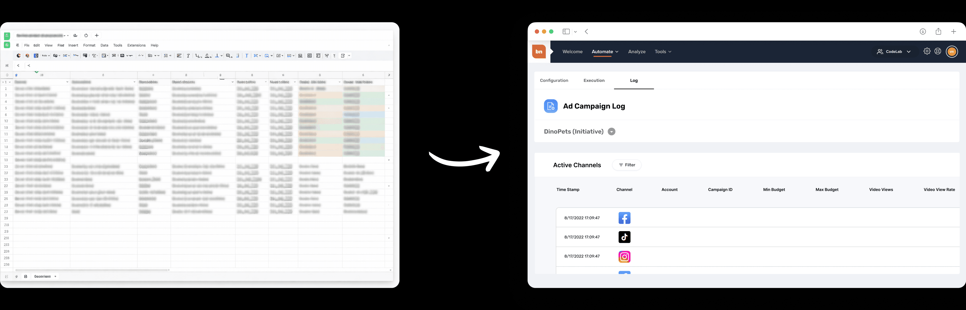
Campaign Activity Log
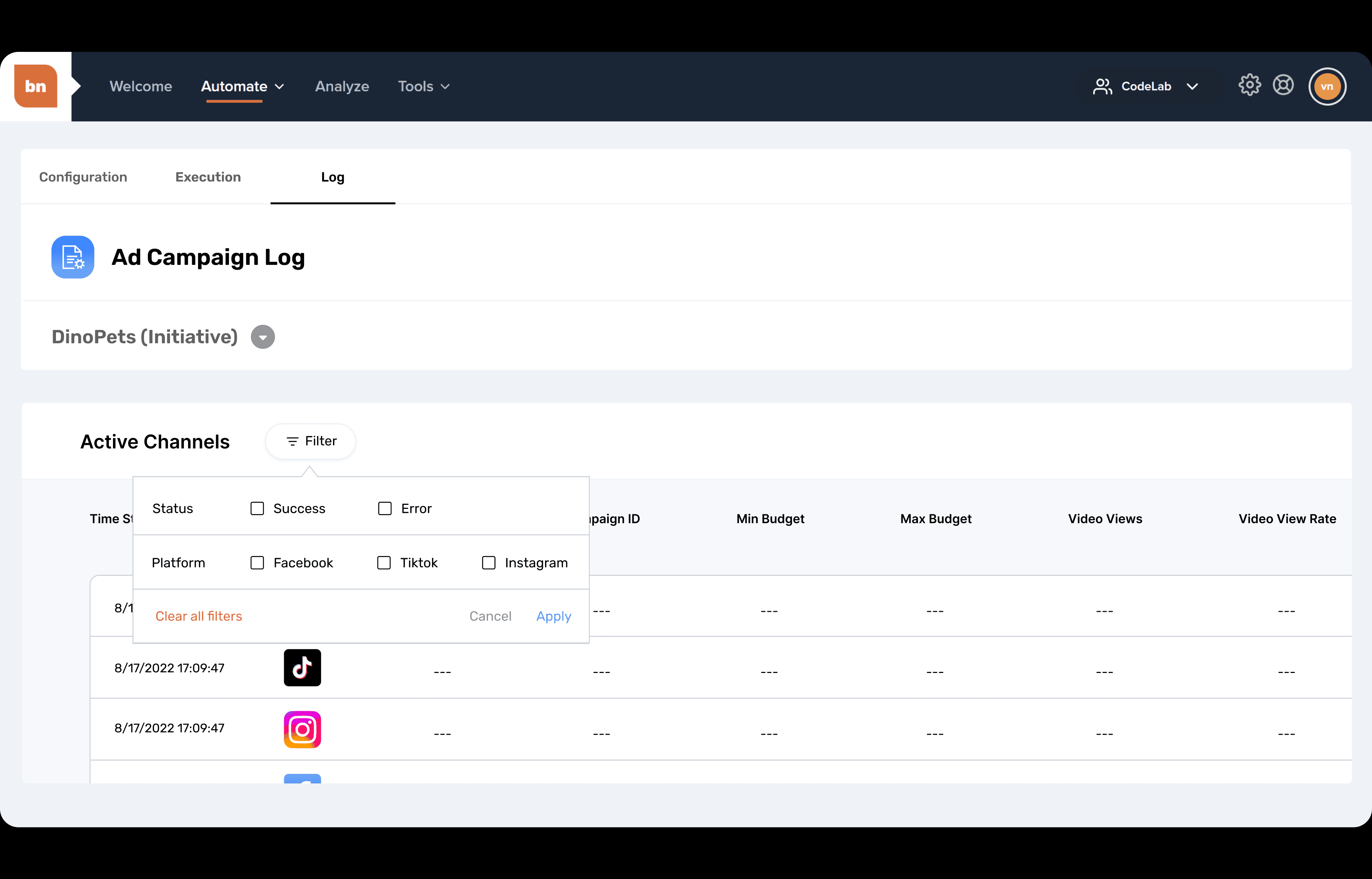
Keeps a clear history of budget changes for easy review and accountability
Helps users quickly spot errors and understand why shifts happened
Designed for clarity and usability instead of overwhelming data density
Conflict & Resolution
Ambiguity early on
At the start, the product direction wasn’t fully defined. Instead of waiting, we used that time to move the project forward.
Took initiative to run competitive analysis and study relevant UI patterns
Proposed early structure and layout directions to help shape the product vision
Built reusable components that made later feedback and iteration much faster
Coordinating work across multiple designers
To avoid overlap and confusion, we intentionally divided ownership.
Each designer owned specific flows or feature areas
We reviewed designs together frequently to keep everything consistent
This helped us move quickly while keeping the product consistent
Results
This work directly supported real advertising decisions for large enterprise clients, including Fortune 500 brands such as Walmart. That meant accuracy, clarity, and trust in the interface were critical.
Improved clarity for high-stakes decision making
Users could understand budget changes, errors, and performance history at a glance instead of digging through overwhelming tables of data.Reduced risk of costly mistakes
Clear logging and visibility helped teams trace changes, catch issues faster, and feel confident about what the system was doing.Stronger trust in the product
Teams felt more comfortable relying on the tool because actions, history, and outcomes were transparent rather than hidden.Designed for real usage, not demos
Every screen was built with the assumption that people were using this daily to manage real money and real performance.
Wrap-Up

My Takeaways
Asking the right questionsUnderstanding the real problem upfront made all the difference.Pre-planning user flows
Mapping out interactions first led to a more intuitive experience.Direct feedback from the BN team
Staying aligned with their needs ensured our solutions were effective.
Next Steps
Take more time to understand what users really need before designing.
Improve team communication and feedback to make collaboration smoother.
Test with users earlier to make sure design choices work before moving forward.
see also